July 29, 2008
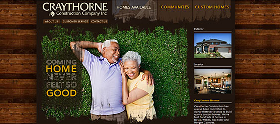
 Just like the concept with Craythorne Homes, Red Olive Designers made a unique ‘custom’ looking site that really sets them apart from your typical custom home building site. The site re-design was a little bit of a branding project as well.
First off, what hits you is the woody motif. It’s the organic feel that’s nice, with cool knotted wood surrounding the surreal family scene (Redwood maybe, I dunno). The tag line, created by yours truly, was a little branding effort put into the project (“Coming Home Never Felt So Good”).
From the back end, we’re proud to show a little Google map integration. The homes are mapped out with Google’s mapping API; something you can play around with. I especially like turning on the Google’s street level so you can take a little tour of the neighborhood.
A tip of the hat goes to our contacts at Craythorne and wish them the best of luck with the new site manicure.